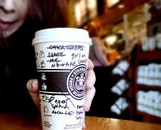
Next week, I start a new job in a government library. As I bid farewell to the multi-national mega-chain retail cafe, I want to write a few posts about customer service and library user experience.
There was a recent Globe and Mail article about choice and customer experience. It boiled down to this:
A myth I often deal with is: “Our customers want lots of choices, and the ability to customize.”…
Big consumer myth No. 2 relates to customization, specifically to companies believing that customers want to customize products. This myth is tied directly back to the logic around consumer choice limitation as a good thing…
Offering your customers more choices, whether in products or features, and the ability to customize will likely not do them, or you, any favours. Having the courage to limit choice, and taking the time to create a personalization path, can create a more favourable customer experience, and may just increase your sales.[full article here]
Are libraries embracing too much customisation? Is this interfering with user experience?
I’ve been working in an environment where personalisation is considered essential to the consumer experience. After all, there is the potential for 87 000 drink combinations. People can choose, tweak, and all that. It can get complicated, though. Sometimes people just want plain old coffee.
Choice is so essential to libraries that it’s impossible to argue against it. As far as collections go, I’m for choice from here to eternity.
In the rush to adopt Web 2.0 principles, libraries, particularly public and academic libraries, have developed web presences that allow for a wealth of customisable features. Lists, avatars, comments, reviews, editable digital library cards, and more.
Is it helpful? Maybe.
Web 2.0 ideas are used, in part, to aid the discovery process for users. But, an overabundance of interactive features can clutter a site, and this can be a roadblock for users. In effect, users are being asked to split their time between finding something and filling out social media elements. Also, there is an implicit competition with other more established and demanding social media platforms.
If the goal is to put materials in users hands, this may not be the most effective route. Demands on user online time is at a premium these days. If a library website is too involving, this can be bad for site traffic.
The next evolution of library websites needs to consider this. The challenge of Web 2.0 for libraries is not just providing opportunities pro forma for user created content. As features prove their usefulness, some streamlining of the social media aspects of the user experience, focusing on speed and simplicity, will have to take place.

No comments