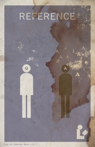
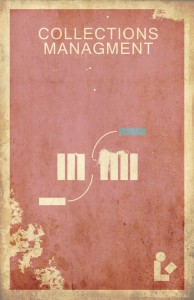
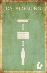
I looked back on my first batch of Library Minimalism posters and wasn’t satisfied. I’ve learned a lot since starting this project and I wanted to go back to tweak my early efforts. In some cases, they became even MORE minimal. Behold.
I’ve got the retro worn look down pretty well. For those who don’t like that look: when I get the store up and running, you’ll be able to buy both distressed and clean prints.


No comments