Archives for category: web tools

library closed

From Stephen’s Lighthouse:

The movement to subscription models has some benefits:

1. You’re not locked in forever (or until it wears out) as a purchase can sometimes do.
2. You have the opportunity to offload the ‘keeping up-to-date factor’ on things that need replacing too often at high initial cost (software, servers, devices, etc,) or upgrade with annoying rapidity (like software and phone models).
3. You want to spread your investment out evenly in the annual budget over many years instead of investing in risky decisions that have higher upfront costs and commitments to servers vs browser access.
4. You want to reduce the risk of making a poor decision and committing to one choice that may be overtaken by innovation, trends, competition, time and events.
5. Access to bigger collections at less cost per user annually (like with the periodical experience)
6. Aggregated relationships with book publishers as has happened with periodical article access and standardization of e-formats and metadata and OpenURL compliance, etc.
7. Bulk influence on copyright and licensing of larger assemblages of content (a la Tasini, etc.)
8. Etc.[full blog post]

The last “etc.” could stand for the benefit of being subject to easily changed (by the vendor) terms of use of agreements (c.f. my earlier post on the HarperCollins kerfuffle, a kerfuffle, it should be observed, that could include a great many other vendors).

In fact, though thoroughly optimistic, Abrams’ list is also very one-sided. It’s not hard to imagine why – he is the VP Strategic Partnerships and Markets for Gale Cengage.  EBook sales are his business.  Read the rest of this entry »

Rule of Thirds

My weekly update came from LinkedIn today. Nowhere on the internet is a profile I more readily let languish. I’m not the only one.

Most of us are begrudgingly committed to LinkedIn because of the ongoing buzz as a job seach tool. Following the advice of the Internet, I need to spend that 45 minutes and update my LinkedIn profile. Afterall, not much looks worse these days than an out of date profile.

And, then what?

I find it hard to invest time in a social media tool that makes me feel like I need a tie and my interview face to use it. Not to mention, where do I find the time for it amongst my professional and personal responsibilities.

I’m not a full-time social media guru, after all. Like a lot of information professional, social media is important, but only one part of my professional reality. So, I’ve been thinking about a social media strategy that could work for me (and maybe you, too). Read the rest of this entry »

Via @NYPLMaps (New York Public Library’s Map Division).

Conductor: www.mta.me from Alexander Chen on Vimeo.

From Chen’s site:

Conductor turns the New York subway system into an interactive string instrument. Using the MTA’s actual subway schedule, the piece begins in realtime by spawning trains which departed in the last minute, then continues accelerating through a 24 hour loop. The visuals are based on Massimo Vignelli’s 1972 diagram.

A  mesmerizing way to re-present geographic information. It also reminds me of video games (gotta love SNAFU) I played back in the Eighties.

For anyone not hip to it, the NYPL’s Map Division has been tweeting an online map of the day. Cartographophiles (a word?)  like me can dig it. But, if one new map a day isn’t enough, why not look at their digital collection and drool.

A lonely man on the four square field.

A random lonely man on the four square field.

The below infographic has been bumping around (It came to me via Stephen’s Lighthouse, who got it here.).

four square growing

It’s good news for Four Square. Is it good news for us? Is it yet another social media time drain we have to adopt to survive online?

At the moment, I personally don’t really get Four Square. Why would someone want to be mayor of a retail outlet, like Starbucks or wherever?

In that light, Four Square looks like a thin game layer draped over an overt marketing carrot-and-stick. Looking at the top check-ins that the infographic lists, it’s clear that Four Square wants to make sure businesses see the value.

Four Square could be a new outlet for vacuos, vain consumer culture. But, that’s what people we were saying about Twitter a couple short years ago.

As one friend noted, Egyptians are using the Internet to free their country and we’re using it to show we went to Wendy’s. That’s the point. It took a few years for people to find ways to do such impressive things with  Twitter and Facebook.

I may not start my Four Square account this weekend. I’m still not completely sold on Twitter (but it’s growing on me). There is a part of me that will try anything (at least for a while) once I have the time.

Should libraries get in on Four Square?

There are so many competing social media demands, that taking on a new platform can drain other efforts. It’s important to weigh the cost/benefits of getting involved and to develop a manageable, adaptable, and achievable strategy.

Librarians are already hatching ideas and talking about it.


Map of London

Hand-drawn map of London by Stephen Welter

The New York Public Library hosted a neat looking panel today.

Future Library: Socializing History with Maps, Hosted by The New York Public Library

Event Description:

Speakers:

  • Matt Knutzen, Geospatial Librarian at the New York Public Library
  • Alex Rainert, Head of Product at Foursquare
  • Jesse Friedman, Product Marketing Manager at Google Maps and Earth
  • Jack Eichenbaum, Queens Borough Historian[NYPL’s event listing]

It’s a shame when you hear about something interesting, and it’s too late, and it’s in another country. Where are the teleporters, already? Science, I’m looking at you

Moving on, it’s exciting to imagine maps being used like wikis.  It’s a field that has largely been dominated by businesses and advertising, but there is a lot of potential here for less commercial uses. OpenStreetMap is an open source project already doing this.

Other popular free(but not commercial free) resources, like Google Maps or Bing’s equivalent, can be an underused tools for pushing community information out to library users and visitors.

Imagine walkable or bikeable tours you could follow via smart phone, with info links, archival photos galleries, recorded personal testimonials, and other information. Online maps can be turned passing on community knowledge that is often lost or fragmented by .

Or arts walks. Or even digitally augmented literary scavenger hunts combining geo-caching and book releases.

Like most web-based tools, I’m pretty sure the most en-genius ideas haven’t been thought of yet. The opportunity is there for any locally minded persons who want to plant a few flags in the digital world.

Also, how cool would it be to be a Geospatial Librarian. I want one of those business cards!

***Addendum***

Stephen Welter’s portfolio site. Why not promote the analog approach?

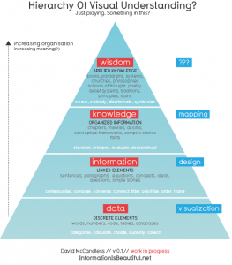
A great little info-graphic from Information is Beautiful (my favourite info-design site):

But, this is not necessarily a new concept (from the I.is B. post).

This structure has been around for a while. (In fact does anyone knows who first came up with it?). The only new thing is relating it to visuals. And giving it a nice font.

One interesting thing. If you visualise information without designing it, you often end up with a mush or a meaningless thicket.

A lot of times, as part of the reference process, “information” and “data” are considered enough to meet user needs, leaving the higher levels of the triangle to the user’s discretion.

As librarians increasingly become moderators or brokers of information, staking a claim on those higher tiers may be worthwhile. Information design can do a lot to achieve this.

Libraries are in the information sharing business, so considering how we present information visually is pretty important. I’m a big fan on the role design can play in representing complex ideas. The ability to take raw information and make it informative is something that makes good information design invaluable.

It may seem like a superficial concern, but information design is going to be more and more relevant.

The list is the simplest and most ubiquitous tool for returning information to users (be it via search engine, OPAC, or written lists of suggested titles).  Even tag clouds are essential elaborate lists, but they are moves in the right direction.

The drive towards the semantic web (one day, maybe?) will lead to increased  expectations from users.  Search tools and providers will  have to consider more complex and subtle contextual inputs. Because the results themselves will be increasingly nuanced, the dynamics of how this information is presented will be crucial.

I’ve really no idea about how this will turn out. But, since search engine results are essentially laid out the same now as in the 90s, I’d be open to any sort of evolution.

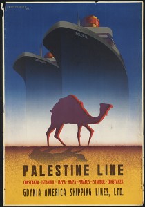
Palestine Line

The Boston Public Library has been developing a pretty amazing and eclectic photo gallery up on flickr, all stuff scanned from their archives and special collections.

I’m partial to the Travel Poster collection. There’s also impressive Match Cover and Stereograph sets.

SterographIt’s a pretty extensive (almost 17 000 items)  example of a library using popular social media software to push out parts of collections normally inaccessible to the average library visitor.

Also, it’s just plain neat.

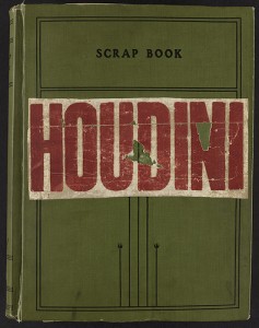
Houdini scrapbook

I was going to get my PhD in English Literature at one point. It didn’t work out. I’m much happier being a librarian.

The video is via xtranormal, which offers tools for throwing together short animated videos for the web. Basically, if you can type, they say, you can make a movie. It’s pretty easy.

Is anyone using this for online book talks or web tutorials? It could be a great way to spice up your library site/blog.

I made the video below in about 5 minutes.