Archives for posts with tag: Design

I heard about Jane McGonigal and her book Reality is Broken: Why Games Make Us Better and how They Can Change the World through a radio doc on CBC’s Spark.

She also has a TED talk.

Is this something libraries can get in on? Libraries have always been a sort of augmented reality tool (using analogue books (old fashioned information access) and now with more high-tech Internet based tools). It’s only one more step to add a game layer. The NYPL’s Find the Future is an example that combines learning and adventure through a mix of the physical library and laptops or smartphones. Gaming and reality are no longer so separate.

McGonigal may come off as a little optimistic, but she’s pushing an emerging idea. You can check out some of McGonigal’s games here.

What through video games is possible? Collaboration and crowd-sourcing scientific research? Breaking down social barriers? I don’t know if video games and gaming CAN solve all our problems. I do think that it is necessary to rethink radically what we can accomplish since it’s a media form that has pretty much overtaken EVERY other media we’ve ever come up with.


From the Guardian UK:

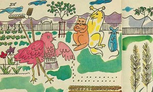
They are a long way from the iconic pop art for which he is best known but a set of illustrations for a children’s book series by Andy Warhol are set to go up for auction in New York next month.

Warhol’s pictures illustrate the story of the little red hen, a folk tale about the value of team work, and show a perky little red hen happily sowing her grains of wheat, as a lazy cat, mouse and dog – who is reading the paper – look on. They were drawn by Warhol early in his career, between 1957 and 1959, for the Doubleday Book Club’s popular series Best in Children’s Books.

The Warhol illustrations will be auctioned on 9 December as part of Bloomsbury Auctions’s sale of 365 original illustrations and books, alongside a host of pictures and letters from 19th-century fairytale illustrator Arthur Rackham, a privately printed edition of Beatrix Potter’s The Tailor of Gloucester, rare Oz books by L Frank Baum and the artistic estate of award-winning African American children’s illustrator Tom Feelings.[source]

Cool, right? I love when artists chip in for children’s lit., even if it’s just for the cover. Anyways, here’s some info on the A. Warhol kid’s book opus.

Also, I’m jealous and want to break my watercolours out!

This came to me via @indie_librarian via (@wawoodworth)


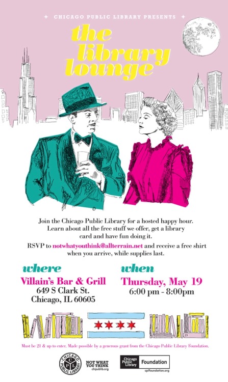
More details on this event here. (Note: fans of the #Partyhard library agenda are probably in love with this idea.) Also, check out this design contest.  It’s a pretty hip and locally driven aesthetic they’re breeding. As a design minded fellow, I can’t understate how much I like this kind of stuff. Good on you, CPL.

I saw all this and suddenly wanted a job at the Chicago Public Library. But really, what I want is a job where I can work with some community to build something similar. Data management is OK, but, man, I miss working with clients/users/information-seekers/people-about-town/etc.

For now, here’s to better living through design.

Winner.

The Canadian Library Association has announced the 2011 Amelia Frances Howard-Gibbon Illustrator’s Award Winner and Honour Books.

The winner is Roslyn Rutabaga and the Biggest Hole on Earth! (Groundwood Press), written and illustrated by Marie-Louise Gay. Honour books are Book of Big Brothers (Groundwood Press), illustrated by Luc Melanson and written by Cary Fagan, and Owls See Clearly at Night: a Michif alphabet (Simply Read Books), written and illustrated by Julie Flett.

Roslyn’s exuberant and adventurous spirit comes in handy when she decides to dig her way to the South Pole. In Roslyn Rutabaga and the Biggest Hole on Earth! Marie-Louise Gay uses expressive mixed-media illustrations that offer intriguing details, textures and perspectives. The reader is invited to share Roslyn excited determination and to spend time exploring each page. This is the third time that Gay has won the Amelia Award.

Honourable mention goes to Luc Melanson for Book of Big Brothers, a fun and affectionate story told from the point-of-view of the youngest of three brothers. With a touch of humour, nostalgia and joy, Melanson’s retro-style illustrations complement Fagan’s narrative perfectly and bring a fresh approach to the timeless story of growing up with siblings.

Honourable mention also goes to Julie Flett for Owls See Clearly at Night: a Michif alphabet This is a unique linguistic and visual treat. Flett’s striking illustrations are deceptively simple. The use of silhouettes with bright spots of colour, create compositions that are striking in their beauty and elegance. They convey a connection with the natural world and also a sense of loss and isolation. This book has a subtle, gripping power.[read the whole thing]

I’m on the committee (and helped write the press release). It was hard to exclude some books, but after long discussions and some secret ballots we came up with winners. All the illustrators and authors on the short and long lists were amazing, making this job both fun and hard.

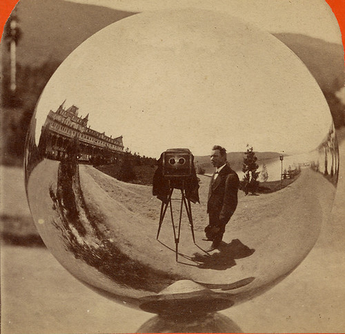
G.S. Irish, Photographer - Reflection in a Gazing Ball

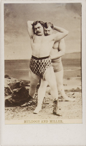
From @PhotosOfThePast comes a link to an amazing collection of early photography and pre/proto-photography pictures and tech (like a set of neat pics of a camera obscura kit). Totally worth the time spent browsing. Thanks to Beverly(and her husband) for putting this together.

Muldoon and Miller - Wrestlers - Carte-de-visite

An interesting post from Aaron Schmidt at Walking Paper on the merits of simplified library web sites.

Antoine de Saint-Exupery, a daring pilot and talented author, also weighed in on user experience:

“In anything at all, perfection is finally attained not when there is no longer anything to add, but when there is no longer anything to take away.”

In some ways, libraries have been taking the opposite approach. We’ve gotten in the habit of tacking on new services and taking on new responsibilities, and many library websites can be seen as piecemeal collections of patron engagement tactics…

There are two ways to increase the amount of attention the bits of a website receive: either by increasing staffing and funding, or reducing the number of bits. An extreme example: imagine if your web team was only responsible for the page consisting of your library’s contact information, location, and one book recommendation per week. They’d be able to spend plenty of time on this page, testing, experimenting, and revising regularly. It would be a great page.

For years, I’ve heard talk about libraries cutting the cord on irrelevant services. Yet I haven’t heard as much discussion about which sacred web cows we can put out to pasture. This might in part be owing to the perception that a 200-page website isn’t more expensive to manage than a 50-page one. While probably true in terms of hosting fees, it isn’t otherwise true. Good content takes staff time to produce and arrange, and the navigational overhead can be a time expenditure for users.

I’m not suggesting that libraries shouldn’t try new things or add content to their sites. They should. Still, the library world needs to start a dialog about an additional way to prevent stagnation: subtraction.[read the full post]

People following this blog know my affection for minimalism as a creative conceit. Apart from aesthetics, I really believe there’s merit to simplifying library online experiences (something I’ve argued for in the past).

Schmidt takes aim at the current library web-design ethos of trying to stake as much online territory as possible. But, enthusiasm and ambition can be a downfall. There are many library landing pages with so many content and navigation options that it’s difficult to really find specific things. Read the rest of this entry »

Have you heard the news?

Recently, Wired magazine declared the death of the web:

You wake up and check your email on your bedside iPad — that’s one app. During breakfast you browse Facebook, Twitter, and The New York Times — three more apps. On the way to the office, you listen to a podcast on your smartphone. Another app. At work, you scroll through RSS feeds in a reader and have Skype and IM conversations. More apps. At the end of the day, you come home, make dinner while listening to Pandora, play some games on Xbox Live, and watch a movie on Netflix’s streaming service.

You’ve spent the day on the Internet — but not on the Web. And you are not alone.

This is not a trivial distinction. Over the past few years, one of the most important shifts in the digital world has been the move from the wide-open Web to semiclosed platforms that use the Internet for transport but not the browser for display. It’s driven primarily by the rise of the iPhone model of mobile computing, and it’s a world Google can’t crawl, one where HTML doesn’t rule. And it’s the world that consumers are increasingly choosing, not because they’re rejecting the idea of the Web but because these dedicated platforms often just work better or fit better into their lives (the screen comes to them, they don’t have to go to the screen). The fact that it’s easier for companies to make money on these platforms only cements the trend. Producers and consumers agree: The Web is not the culmination of the digital revolution.[full article]

Or in Clue-speak:  it was the User in the Internet with the App.

Declaring things dead doesn’t have the same bombast it used to, and it’s not entirely new news. Web 2.0 has been pushing it’s way into the Internet-user’s life for a few years now, and Wired is talking about the logical extension of that trend.

But, the article makes an important distinction between “browsing” and “getting.” This has to do with the rise apps-based user expectations and an achieved critical mass of online-content. I think browsing was useful in the past because there was no guarantee anything you wanted was out there. Now, Internet-savvy users are  surprised when something is NOT online. So, it’s not about finding, it’s about retrieving.

Libraries should play close attention to this, not because we’re not in the information/content retrieving business. This is what a good library does well, after all.

The issue at stake is competition.

The barriers to entry in the library’s field of online content delivery (eBooks, reference information, audio books, etc.) have been knocked down or scaled by competition that doesn’t share the same value system, operations cost, or even expectations of open access.

Again, this is not new news, just more pressure on libraries to innovate.

Looking for a counter-point? Try What’s Wrong With ‘X Is Dead’, from the Atlantic

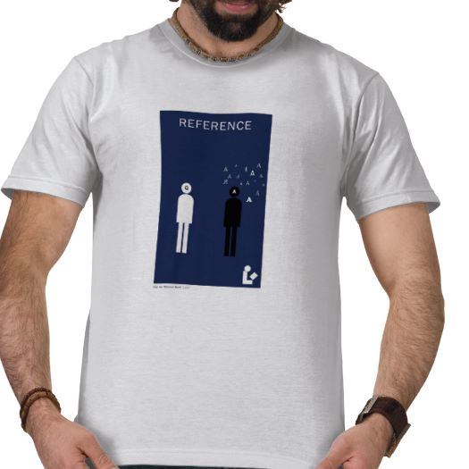
Reference Tshirt

I had some extra time last week, so I’ve been able to finally roll this out.

Fans of this site and of my Library Minimalism series can get in on the action.

You see, Drop the Reference Bomb’s merch store is now live!

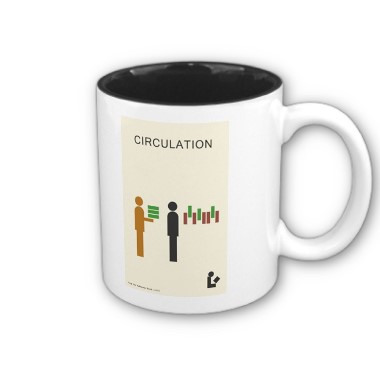
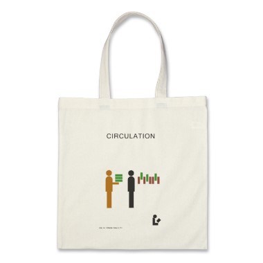
Right now, there are posters, mugs, t-shirts, and totes that feature the best from my Library Minimalism prints. More items and prints will be added as inspiration and time allows, but I think I’m off to a good start.

Circulation Mug

Why Zazzle?

Because it’s customizable!

Don’t like the colour, fit, type of shirt? Want a stainless steel travel mug instead of a ceramic one? There are lots of options to choose from. I’ll start you off, but the final choice is up to you!

There are lots of library themed stuff out there, but I guarantee there’s not much like this! Plus, big spenders ($50 or more and not just at my store) from the US can get free shipping. I’ll also keep everyone posted about sales as they happen.

Cheers!

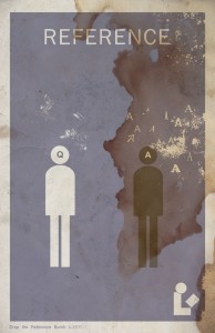
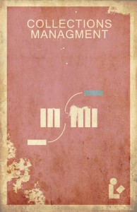
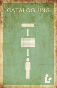
I looked back on my first batch of Library Minimalism posters and wasn’t satisfied. I’ve learned a lot since starting this project and I wanted to go back to tweak my early efforts. In some cases, they became even MORE minimal. Behold.

I’ve got the retro worn look down pretty well. For those who don’t like that look: when I get the store up and running, you’ll be able to buy both distressed and clean prints.


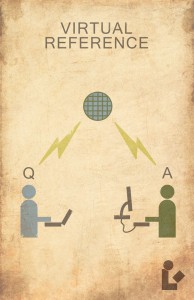
Another entry in the Library Minimalism category: Virtual Reference.

Though, I suppose if an actual poster looked this rough and was hanging in your library, you’d want to replace it. Or, more likely you’d want watch out for wandering hordes of mutants.

I swear I’ll get back to regular posts soon, but these minimalist pictures are just so much darn fun.