Archives for posts with tag: online

Map of London

Hand-drawn map of London by Stephen Welter

The New York Public Library hosted a neat looking panel today.

Future Library: Socializing History with Maps, Hosted by The New York Public Library

Event Description:

Speakers:

  • Matt Knutzen, Geospatial Librarian at the New York Public Library
  • Alex Rainert, Head of Product at Foursquare
  • Jesse Friedman, Product Marketing Manager at Google Maps and Earth
  • Jack Eichenbaum, Queens Borough Historian[NYPL’s event listing]

It’s a shame when you hear about something interesting, and it’s too late, and it’s in another country. Where are the teleporters, already? Science, I’m looking at you

Moving on, it’s exciting to imagine maps being used like wikis.  It’s a field that has largely been dominated by businesses and advertising, but there is a lot of potential here for less commercial uses. OpenStreetMap is an open source project already doing this.

Other popular free(but not commercial free) resources, like Google Maps or Bing’s equivalent, can be an underused tools for pushing community information out to library users and visitors.

Imagine walkable or bikeable tours you could follow via smart phone, with info links, archival photos galleries, recorded personal testimonials, and other information. Online maps can be turned passing on community knowledge that is often lost or fragmented by .

Or arts walks. Or even digitally augmented literary scavenger hunts combining geo-caching and book releases.

Like most web-based tools, I’m pretty sure the most en-genius ideas haven’t been thought of yet. The opportunity is there for any locally minded persons who want to plant a few flags in the digital world.

Also, how cool would it be to be a Geospatial Librarian. I want one of those business cards!

***Addendum***

Stephen Welter’s portfolio site. Why not promote the analog approach?

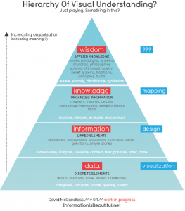
A great little info-graphic from Information is Beautiful (my favourite info-design site):

But, this is not necessarily a new concept (from the I.is B. post).

This structure has been around for a while. (In fact does anyone knows who first came up with it?). The only new thing is relating it to visuals. And giving it a nice font.

One interesting thing. If you visualise information without designing it, you often end up with a mush or a meaningless thicket.

A lot of times, as part of the reference process, “information” and “data” are considered enough to meet user needs, leaving the higher levels of the triangle to the user’s discretion.

As librarians increasingly become moderators or brokers of information, staking a claim on those higher tiers may be worthwhile. Information design can do a lot to achieve this.

Libraries are in the information sharing business, so considering how we present information visually is pretty important. I’m a big fan on the role design can play in representing complex ideas. The ability to take raw information and make it informative is something that makes good information design invaluable.

It may seem like a superficial concern, but information design is going to be more and more relevant.

The list is the simplest and most ubiquitous tool for returning information to users (be it via search engine, OPAC, or written lists of suggested titles).  Even tag clouds are essential elaborate lists, but they are moves in the right direction.

The drive towards the semantic web (one day, maybe?) will lead to increased  expectations from users.  Search tools and providers will  have to consider more complex and subtle contextual inputs. Because the results themselves will be increasingly nuanced, the dynamics of how this information is presented will be crucial.

I’ve really no idea about how this will turn out. But, since search engine results are essentially laid out the same now as in the 90s, I’d be open to any sort of evolution.

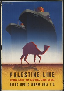
Palestine Line

The Boston Public Library has been developing a pretty amazing and eclectic photo gallery up on flickr, all stuff scanned from their archives and special collections.

I’m partial to the Travel Poster collection. There’s also impressive Match Cover and Stereograph sets.

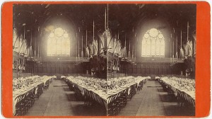
SterographIt’s a pretty extensive (almost 17 000 items)  example of a library using popular social media software to push out parts of collections normally inaccessible to the average library visitor.

Also, it’s just plain neat.

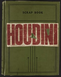
Houdini scrapbook

I was going to get my PhD in English Literature at one point. It didn’t work out. I’m much happier being a librarian.

The video is via xtranormal, which offers tools for throwing together short animated videos for the web. Basically, if you can type, they say, you can make a movie. It’s pretty easy.

Is anyone using this for online book talks or web tutorials? It could be a great way to spice up your library site/blog.

I made the video below in about 5 minutes.

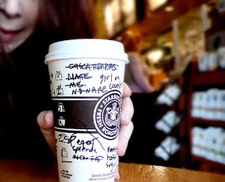
latte everywhere

Next week, I start a new job in a government library. As I bid farewell to the multi-national mega-chain retail cafe, I want to write a few posts about customer service and library user experience.

There was a recent Globe and Mail article about choice and customer experience. It boiled down to this:

A myth I often deal with is: “Our customers want lots of choices, and the ability to customize.”…

Big consumer myth No. 2 relates to customization, specifically to companies believing that customers want to customize products. This myth is tied directly back to the logic around consumer choice limitation as a good thing…

Offering your customers more choices, whether in products or features, and the ability to customize will likely not do them, or you, any favours. Having the courage to limit choice, and taking the time to create a personalization path, can create a more favourable customer experience, and may just increase your sales.[full article here]

Are libraries embracing too much customisation? Is this interfering with user experience?

Read the rest of this entry »