Archives for category: User experience

Under Siege!
With all the the excitement around eReaders, eBooks, social media, and all the other innovations libraries are taking on, it’s easy to forget that public libraries are very much under siege.

From the Guardian UK:

Labour politicians and campaigners have condemned the head of the Museums, Libraries and Archives Council for suggesting that public libraries are primarily used by the white middle classes.
The controversial comments were made by Roy Clare, the council’s chief executive, who argued that the service should not be preserved in “aspic“… [full article here]

In the UK (and the US, too… and, well, lots of places), where austerity measures are gutting public spending. Public libraries and their patrons have to put up the good fight to keep branches open. Ridiculous, wrong-headed comments from government ministers do no good.

Read the rest of this entry »

Book Cover ArchiveI will not say the old adage is moot, but cover design has become pretty central to the book experience. This is especially the case when it comes to browsing shelves for your next read.

The Book Cover Archive shows off how book makers try to catch readers attention. The site is a huge, searchable database that celebrates the best and brightest of cover design industry right now.

As a design-freak, I love sites like this. It makes my eyes greedy and my soul a little jealous (Wouldn’t it be fun to make art like that all the time?).

book cover archive screen shot In a perfect world, libraries would be able to constantly update book covers to keep up with design trends. Realistically, it’d be impossible.

Online, though, it’s different. Online catalogue records could reflect newer designs for covers of older books. This can help breathe new life into editions passed over by browsers as dated. It’s an easy way to capitalize on marketing trends and cash in on the cues readers expect from book covers.

In the graphic designer part of my life, I’ve had some practical experience in the book cover field.Pretty nice, right? The poetry inside is good, too.

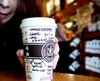
latte everywhere

Next week, I start a new job in a government library. As I bid farewell to the multi-national mega-chain retail cafe, I want to write a few posts about customer service and library user experience.

There was a recent Globe and Mail article about choice and customer experience. It boiled down to this:

A myth I often deal with is: “Our customers want lots of choices, and the ability to customize.”…

Big consumer myth No. 2 relates to customization, specifically to companies believing that customers want to customize products. This myth is tied directly back to the logic around consumer choice limitation as a good thing…

Offering your customers more choices, whether in products or features, and the ability to customize will likely not do them, or you, any favours. Having the courage to limit choice, and taking the time to create a personalization path, can create a more favourable customer experience, and may just increase your sales.[full article here]

Are libraries embracing too much customisation? Is this interfering with user experience?

Read the rest of this entry »